
If you're responsible for designing a web application, you know that engagement is key to success. A well-designed app will keep users coming back, while a poorly designed one will quickly lose them. In fact, 25% of project failures are attributed to UI/UX design issues!
Engaging web application UI designs can help boost user engagement and retention by providing users with intuitive navigation, attractive visuals, and memorable experiences. This facilitates higher task completion rates and improved user satisfaction, while helping to reduce development time and costs.
In this article, we'll share 11 of the best web application design strategies to help you get started. We'll cover everything from navigation to color palettes, and show you how to use each strategy to create a more engaging and enjoyable experience for your users.
- What is web app design?
- Web apps vs websites
- What makes for strong web application designs?
- 11 proven ways to create engaging web application UI designs
- 1. Utilize context-aware navigation
- 2. Stick to a familiar layout
- 3. Don’t just focus on one device
- 4. Prioritize compelling content
- 5. Aim for visual consistency
- 6. Choose the right color scheme
- 7. Make use of high contrast
- 8. Remember that less is more
- 9. Use negative space strategically
- 10. Have a clear call to action
- 11. Try using subtle animations
- Conclusion
What is web app design?
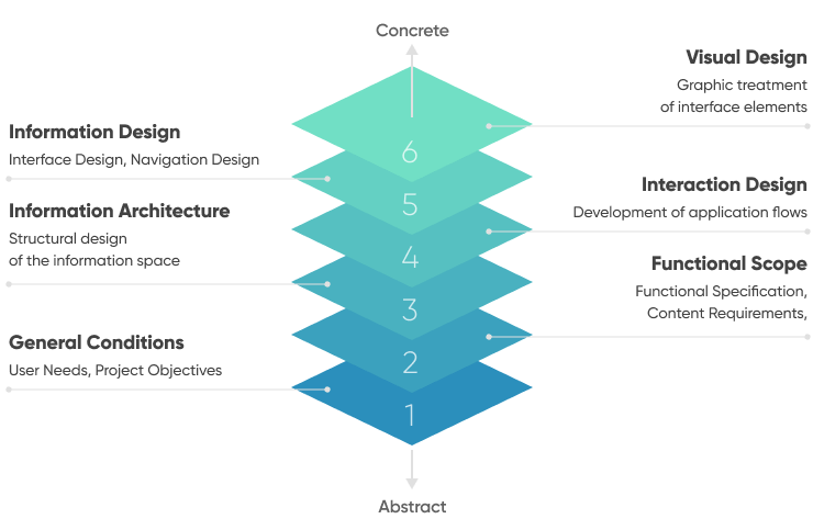
Web application design is the process of creating and planning out the user experience and visual design of an interactive web application. This process can be broken down into 6 key areas, spanning from highly abstract to concrete.
Web apps vs websites
Web apps and websites share many similarities. Both can be accessed from and operate without the need to install additional software. Both require keen attention to graphic design and user experience (UX).
However, regardless of their similarities, web apps and websites are, in fact, different. They have different uses, user needs, and expectations. Websites, for example, are typically designed to provide users information or accept basic inputs from users. Think of sites like Wikipedia or the website you are reading this blog on right now!
Web applications, on the other hand, are designed to be more interactive and dynamic. They are designed to help users accomplish a task or provide users a service. Think of things like Spotify or Salesforce. Web app development and design costs can be higher than those for websites because typically more backend development work and front-end design work is required to ensure the web application can perform the necessary (usually more complex) functions.
Let’s take a look at the key differences between web applications and websites:
| WEB APPLICATION | WEBSITE | |
|---|---|---|
| UI functionality | Dynamic, interactive, promotes user interaction | Static |
| Main purpose | Allows users to perform actions | Display or gather information |
| User flow | Predefined user flows, guides users step-by step through distinct processes | Open user flow |
| Design focus | Responsive site elements, performance across multiple devices, and a streamlined user journey | Planning the structure and content to look clear and visually attractive |
| Development cost | Depends on the complexity of the functionality but typically higher than website development costs | Depends on the UI design work needed but typically lower than web app development costs |
| Programming languages | HTML, CSS, JavaScript, PHP, Python, Ruby | HTML, CSS, JavaScript |
What makes for strong web application designs?
The goal of the web app design process is to create an enjoyable and intuitive experience for the user that engages them and guides them through the web application. But what are the key elements of a strong web application design?
Above all else, a strong web application design is:
- Intuitive: The web application’s user interface should be designed in such a way that makes it easy for real users to use it intuitively. Anything that has a steep learning curve should be avoided.
- Compelling: The user interface should utilize strong, clear design elements that adhere to basic design principles such as visual consistency and help the app stand out.
- Brand-compliant: The web design should be consistent with your brand’s style and look across all devices. It should help to communicate the brand’s message to customers through visual elements.
- Responsive: Your web app design should be responsive, meaning that it should look great and work properly across all devices and screen sizes.
- Reliable: Performance is key when it comes to web app design. A strong web app should load quickly and be able to handle a large number of requests.
- Accessible: The design should be accessible to people with disabilities and should support all major browsers.
11 proven ways to create engaging web application UI designs
Creating an engaging user interface (UI) design for a web app is essential to ensuring your users have an enjoyable experience and keep coming back for more.
In this section, we'll discuss 11 proven ways to create engaging UI designs for web apps as well as provide real web app design examples to inspire you along the way.
Utilize context-aware navigation
First up in our list of web app design ideas are context-aware navigation menus. This is a unique type of web app navigation that takes into account user data to provide a personalized navigational experience for each user. This could be as simple as basing the navigation on the user’s current location within the web app or as complex as considering the user’s full web app activity, personal interests, and preferences.
For example, if the user is looking for information about a product, the navigation menu could display links to product pages, product reviews, and FAQs about the product.
Another example of this type of navigation in action can be seen in Clickup’s interface. The app’s homescreen adapts based on what’s most important for the user to see at any given time. It also provides plenty of navigational jumping off points to help the user dive deeper into areas such as the calendar, inbox, and notifications.
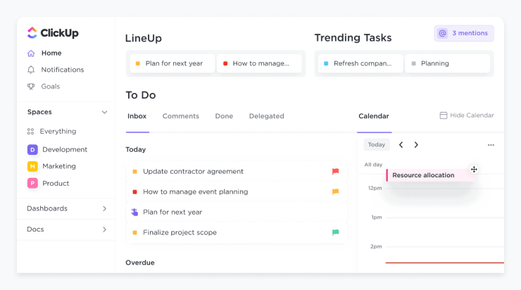
This kind of adaptive and personalized user interface design element can help take what would normally be an overwhelming web application and turn it into something that’s very usable and engaging.
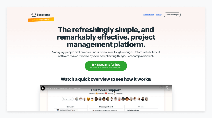
Stick to a familiar layout
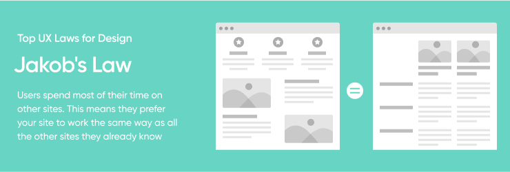
Jackob’s Law tells us that users spend a majority of their time on sites other than yours. Because of this, users expect your site to function similarly to other sites. Users simply prefer familiarity. To ensure your web app is intuitive to use and keeps users engaged, you should mirror common models that users are familiar with. Doing so will allow users to focus on using the web application rather than learning how to use it.
The less mental energy users spend on learning an interface, the more they can dedicate towards achieving their objective. While designing a user interface, you should follow the common design patterns and conventions in strategic areas such as page structure, workflows, navigation, and placement of expected elements such as search.
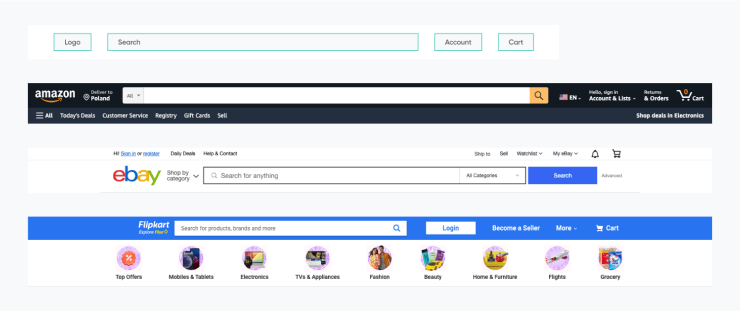
In the example below you’ll see that elements are placed where used expect: the shopping cart is in the top right, the logo is in the top left, and the search bar is in the center of the screen.
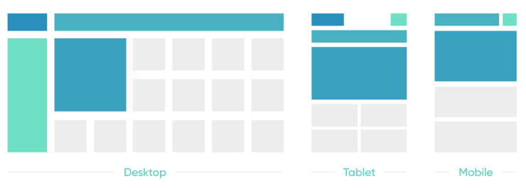
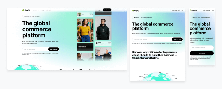
Don’t just focus on one device
It’s no longer acceptable to have a web app that just works on desktops. Users demand web app designs that provide a seamless experience on mobile devices and tablets as well. To keep engagement high and avoid customers abandoning your web app, it should be accessible on all devices.
This type of accessibility across devices is known as responsive web app design. Responsive web app design requires all design elements to adapt to the size and capability of each device, allowing users to have a tailored experience.
You can see that Shopify’s site adapts to provide a responsive experience on all devices. Users are still able to see the headline and call to action, but on the smaller screens the images are removed.
Prioritize compelling content
Design and content go hand in hand. You can have a great web application design but without relevant, compelling content, your design will fall flat. Content within the web app should be tailored to the target audience, as well as organized and presented in an intuitive way.
This can be achieved through careful design decisions, such as making sure buttons, text, and images are easy to find and clearly labeled. Additionally, conversational interfaces can help guide users through the app, making the experience more interactive and engaging.
Aim for visual consistency
As the user interacts with your web app for the first time, they quickly understand the visual approach of the UI/UX. The user then uses this knowledge to interact with every screen, intuitively understanding the web app’s information hierarchy, organization, and functionality.
The more visually consistent your web app is across pages and across devices, the easier it will be for users to use and engage with your app. It’s all about leaning into the natural ability of the human brain to recognize and recall patterns.
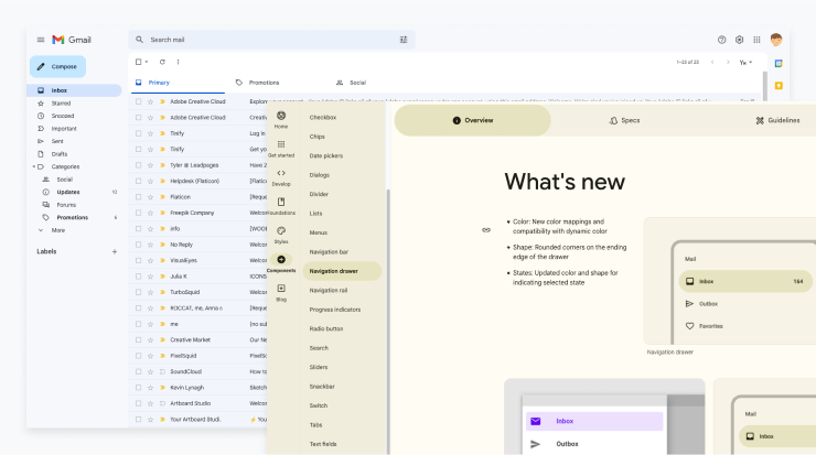
There are many examples of web apps that have strong visual consistency, but one great example is Google. Google uses different layouts for the desktop and mobile versions of the app, but they use the same components and color combinations to keep the visual style consistent. This makes it really easy to move between the desktop and mobile versions of their app.
Choose the right color scheme
Choosing the right color palette for your web app UI can be an important part of creating an engaging experience for your users. Colors can evoke feelings and can be used to influence how your users perceive your web app designs (and the company itself).
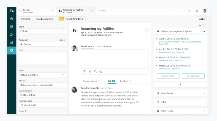
For instance, Zendesk’s color palette consists mostly of gray, white and blue, with small pops of orange, which on this screen have been used to highlight the new ticket. The cool colors create a sense of calmness and professionalism, while also helping the vibrant splash of orange stand out and draw attention to key areas and content.
The number of colors you utilize in your web app design can also have an impact on how it is perceived. A clean interface with only one or two colors will feel quite different than a UI full of a rainbow of colors.
Make use of high contrast
Using high contrast in web applications makes it easier for users to distinguish between different elements on the page, and creates a more visually appealing design overall.
It also makes it easier for users to find the most important elements on a page, and helps to draw attention to specific elements- or features, making them more likely to be noticed. High contrast can also be used to create visual hierarchy, making the most important elements of the design stand out from the rest and making it easier for users to find what they are looking for.
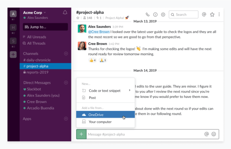
Slack uses blue as a contrast color in two areas on the screen below: on the left panel to show which channel the user is viewing and on the pop-up in the center to show which option the user is hovering over. In both cases, the contrasting color helps to make the app more usable and intuitive for the user.
Remember that less is more
When designing web app UIs, it is important to remember the concept of “less is more.” This means that the fewer fonts and colors used in a design, the better. Too many fonts and colors can overwhelm the user and make it difficult to focus on the content.
Instead, it is best to limit the number of fonts you use to one or two and to use variations of that font where needed. Additionally, be mindful of the colors you use and try to limit them to a few shades. This will help give the design a more unified and aesthetically pleasing look.
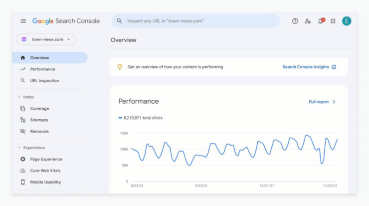
Google Search Console leans into the classic Google minimalism to provide a very easy-to-use interface. They stick to a single font and rely on text sizing and background colors to help the user know what’s most important. They also make use of simple icons to make the interface more intuitive without adding any design clutter.
Use negative space strategically
Negative space can help create an engaging experience by providing structure, visual balance and emphasis on important elements within web apps and native mobile apps. By strategically using the space between and around elements, UI designers can create an efficient layout that can become more intuitive.
Additionally, negative space can help create contrast between elements and create visual hierarchy, enabling users to quickly scan the page and identify the most important elements.
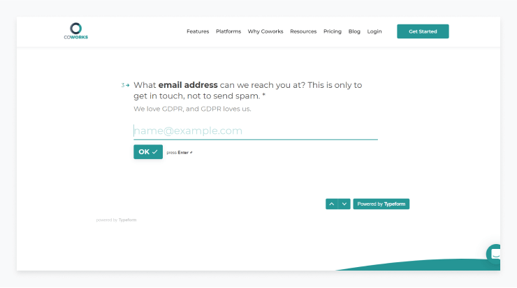
In the screen below you can see that the embeded form (powered by Typeform) leans heavily into the use of negative space to keep the user focused on one thing: the email input box. The negative space that surrounds the input as well as the generally muted interface shows the user clearly what they need to do to proceed to the next step.
Have a clear call to action
A clear call to action (CTA) is an essential element of effective user interface design. It helps to create an engaging experience for users by providing them with a clear indication of what to do and how to do it. By making sure the CTA is clearly visible and that its purpose is clear and concise, users are more likely to take the desired action.
For example, a CTA button should be placed in a prominent location where users can easily spot and click it. The text on the button should succinctly explain the action that will be taken if clicked, and the button itself should stand out against the background.
Try using subtle animations
Microinteractions are an important part of UI design and help to create engaging, intuitive user experiences. They typically involve a single action, such as pressing a button or hovering over an element, that triggers a small animation or change in the interface.
These small changes can provide useful feedback to users, such as confirming an action, or helping to guide them through a process. Done well, microinteractions can make a huge difference to the overall user experience, with subtle yet powerful effects.
Conclusion
Creating a successful web application design is essential to keep engagement high. In this article, we discussed 11 proven strategies for creating engaging web application UI designs that encourage users to keep coming back to use your app.
From using context-aware navigation and prioritizing compelling content to utilizing high contrast and subtle animations, these strategies can help you create an intuitive and enjoyable experience for your users.
Remember, successful custom web app development requires a combination of UX and UI elements, as well as collaboration between design and content teams. Best of luck on your next web app design project!


![How to Design a SaaS Product Users Will Love [with examples]](/uploads/blog/saas-design/saas-design.png)