
![2024 Guide to Navigation Menus [8 Types & Top Tips]](/.netlify/images?url=_astro%2Fnavigation-menus.B3L5ulQz.png&w=740&h=416&dpl=6a2dc680a466470009259c33)
Navigation menus are the backbone of any website or web app, and good navigation menus can make or break a user experience. In fact, almost everyone (94%) says easy navigation is the most important website feature.
But how do you create an effective navigation menu that is both user-friendly and visually appealing? If you’re feeling overwhelmed by the prospect of designing a nav menu for your site, you’re not alone.
In this article, we’ll cover 8 types of navigation menus, top tips for designing effective menus, and provide you a step-by-step guide for designing your own navigation bar.
Read on to learn how to create an effective navigation menu that will optimize your user experience and give you a competitive edge.
What is a navigation menu?
A navigation menu is a critical piece of the overall web design of your site. At its core, a navigation menu is just what it sounds like - a menu that helps users navigate around to different web pages on your site. It can be located at the top, on the side, or even on the bottom of your website and allows visitors to quickly access the different pages and features of the website.
The navigation menu typically includes links to all of the main sections of the website, as well as drop-down menus to access sub-pages or features. This allows users to quickly find what they are looking for, without having to scroll through a long list of pages. The navigation menu can also be used to create a hierarchical structure for the website, making it easier for users to find their way around the site.
A well-designed navigation menu should be easy to use, visually appealing, and organized in a way that makes sense to the user. It should also be responsive, so that it can adjust to different screen sizes and devices.
Why is your website’s navigation menu important?
Navigation menus are an essential part of web design, as they provide a way for visitors to quickly and easily find the content they are looking for while on your website. A well-designed navigation menu can help guide visitors to the right page, making their experience on the website more enjoyable and efficient.
Teams who allocate significant resources to designing and optimizing their website’s navigation will find that they see an increase in:
- User engagement: Users will be able to intuitively find what they are looking for and quickly explore the site, rather than disengage and bounce off your site.
- Brand opinion: Users will find their experience on your site enjoyable and will be more likely to have a positive opinion of your brand as a result.
- Conversion rates: Users will be less likely to bounce off your site and more likely to continue to engage and navigate to sales pages.
- Organic traffic: Well-structure navigation helps search engine crawlers more easily understand your site structure and index pages, providing you a boost in SERP results and organic traffic.
8 types of navigation menus
With so many navigation menu design styles available, it can be hard to decide which will work best for your website. This section will explore the 8 types of website menu structures and discuss their key features and benefits, so you can make the right choice for your website. Let’s get started!
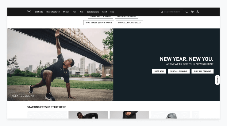
Standard horizontal menu
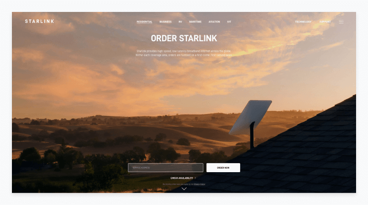
Standard horizontal navigation menus are one of the most common types of menus. They are placed at the top of a website and provide a way for users to quickly access different parts of the site. Horizontal menus are typically designed to expand as users hover or click on the different categories. Although, you can have an ultra-basic horizontal menu that provides only a few options for visitors to click.
Standard horizontal menus usually contain links to pages such as the homepage, About page, Contact page, Blog, and Services. They can also provide a great way to include additional information on the website, such as a search bar, contact information, or a language selection. These extra elements can be added in the form of buttons, drop-down menus, or even a single link.
Pros
- Easy to identify and navigate: Visitors can quickly identify the main areas of the website and find what they are looking for.
- Intuitive: Because this is the most common type of header menu, users will be comfortable using it.
- Saves space: A horizontal header menu is a great way to conserve space on a webpage.
Cons
- Difficult to display a lot of items: If there are too many dropdown menus or menus that appear when a user hovers, it can become difficult to navigate.
- Not always mobile-friendly: A horizontal navigation menu can be difficult to display on mobile devices with smaller screens.
Sticky or fixed menu
A sticky or fixed menu on a website gives the user a consistent navigation experience no matter where they are on the page. It is usually placed at the top of the page and it remains in the same position, even when the user scrolls down the page. This type of menu is especially useful for large websites with a lot of content as it allows the user to quickly access the main navigation points, no matter where they are on the page.
Sticky or fixed menus are very popular in web design as they provide a more consistent navigation experience for the user. They also help to keep the user engaged on the website as they can quickly access the main navigation points no matter where they are on the page.
Pros
- Increased convenience: Users do not have to scroll to the top of the page to navigate via the menu.
- Increased visibility: Key pages such as sales pages or pages with conversion points can be highlighted consistently throughout the user’s experience on the site.
Cons
- Can take up valuable space: Sticky menus can quickly become a nuisance if they take up too much screen space.
- Can be distracting: Especially if they are designed to stand out from the other content on the page, this type of menu can be distracting.
Massive dropdown menu
Massive dropdown menus or sometimes called a “mega menu” is a type of navigation menu found on websites that provide a large collection of navigation links for users. These menus often appear as a set of vertical columns, with each column listing a different set of links.
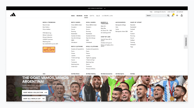
A mega menu is typically used when a website has a large number of categories or pages. The menu is designed to make it easier for a user to find the right page. They can also include images and other elements to provide more visual appeal or assist users in identifying where they want to go.
Pros:
- Gives users the power: This type of menu provides a way for users to look through all options and decide from there where they want to navigate to, eliminating any guesswork.
- Suits businesses with many products or services: For sites that need to provide navigation for tens or hundreds of product lines, this type of navigation may be the only option.
Cons:
- Can be overwhelming: Especially for users with limited technical knowledge, this type of nav bar can be overwhelming, as they contain many more menu items than a typical dropdown menu would.
- Can clutter up a page: All of the options can make it unclear what the major pages are of the website or where a user should go.
- Reduces accessibility: May be difficult to navigate for those with limited motor skills or visual impairments.
Full-screen navigation menu
A full-screen menu is a website design feature that is becoming increasingly popular among web developers. It typically features a full-screen overlay of menu options, triggered when a user clicks on a hamburger menu icon or other button. The menu itself can include drop-down options for a variety of content, such as categories, pages, posts, and other navigation elements or it may feature a simple list of a few key pages.
This style of menu is a modern, eye-catching alternative to some of the other more traditional menu structures we have looked at so far. Especially if you have one or two key services or products to offer, this style of menu may be a good fit.
Pros:
- Increased visibility: A full-screen menu provides web designers with an opportunity to get creative and make the most of their available space. By using a full-screen menu, they can ensure that the navigation options are easy to find and understand.
- Stands out: This menu style communicates clearly that your brand is modern and edgy, helping you to stand out amongst the competition.
Cons:
- Intrusive user experience: A full-screen navigation menu can be intrusive and may cause users to feel overwhelmed or confused. This may be especially true if your website users are an older demographic.
- Long load times: A full-screen navigation bar can take longer to load than traditional menus, which can lead to a slower user experience.
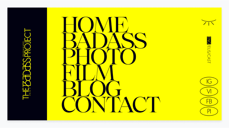
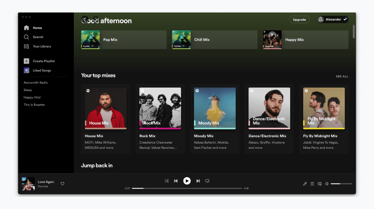
Vertical sidebar menu
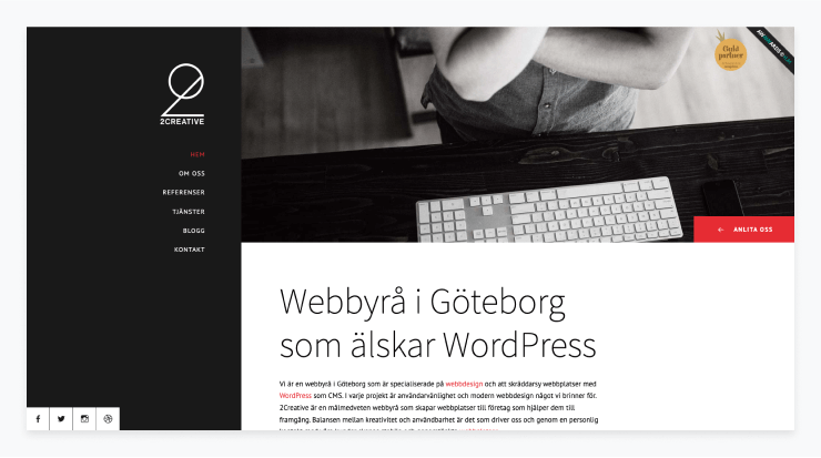
A vertical sidebar menu is a feature commonly found on websites that allows users to quickly and easily access a wide range of content via either a permanent or collapsible vertical sidebar.
It typically consists of a vertical navigation bar located on the left-hand side of the page, which contains a list of text links that can be clicked on to bring up key pages. This style of menu may also be implemented as a hamburger navigation menu that collapses or expands based on a single click by website visitors.
Pros:
- Easily navigable: vertical sidebar menus are simple to use and understand, and make it easy to quickly access content.
- Space efficient: this type of nav bar takes up very little space on the page, so it doesn't disrupt the flow of the website.
Cons:
- Limited visibility: the menu is often tucked away on the side of the page, which means it may be overlooked by some visitors. This is especially true if it is implemented as a collapsible hamburger navigation menu.
- Limited functionality: the menu can only be used to present links to other content, rather than containing actual content.
- Poor scalability: if the website contains a large amount of content, the menu may become cluttered and difficult to navigate.
Footer navigation menu
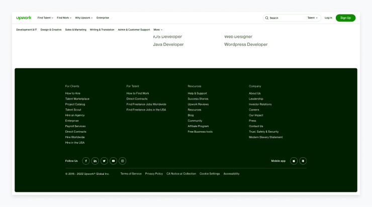
A footer menu is a collection of links located at the bottom of a web page. Usually, the footer menu is not the primary navigation menu on a website but rather a secondary way for users to navigate the site. Footers contain links to other pages within the same website (sometimes to all your pages).
It is meant to provide the user easy access to important pages which may otherwise be difficult to find. This type of menu can be particularly useful for an ecommerce site or online stores that want to provide an organized list of all products or product categories.
Pros:
- Provides quick navigation to many pages: Allows for quick access to important pages that may be difficult to find otherwise.
- Increased convenience: Saves the user from having to scroll to the top of the page or search the site for what they are looking for.
Cons:
- Doesn’t always work on mobile devices: The footer will need to be replaced or otherwise optimized to work on mobile.
- Can’t be the primary navigation: All sites should have a different, primary navigation menu rather than rely on the footer.
Personalized navigation
A personalized navigation menu makes use of website usage data to provide a personalized experience for every user. The main navigation or even secondary navigation menus would be based on each user’s individual browsing habits on the site. This can be a good option for websites that see high return rates.
Pros:
- Works well for high traffic sites: Websites that users typically visit many times can benefit from using usage data to provide a custom experience for return visits.
- Personalization improves engagement: The more tailored a site is to a particular user, the more likely they are to continue to engage with it.
Cons:
- Can be costly to implement: Added complexity and development costs may not be worth it for every website.
- Can be difficult to maintain: Development support will be required when updates to the site architecture are made.
Customizable navigation bar
A customisable navigation menu on a website allows users to quickly and easily navigate through the different pages and sections of the website via their own personally-created menu system. Unlike the personalized menus above, this type of customizable nav bar allows users to decide for themselves what items they want in their menu.
This can work well for web app design that have many advanced tools, all of which won’t be used by a single user. Additionally, it can be a good option for high-touch applications where users are using them on a daily or even hourly basis, helping to justify the initial set up work required.
Pros:
- Works well for web applications: Web apps that are complex and serve many different user groups with different needs can benefit from customization for each user.
- Improves loyalty: Investment in a web app goes up when you have an account with your own personal information and preferences saved.
- Easy navigation once set up: Users will be able to find what they are looking for very easily once they’ve done the initial set up work.
Cons:
- Requires work from users: Unlike personalized menus, this type of menu relies on the users themselves deciding what menu items they want and doing the work to set it up.
- Can be costly to implement: Added complexity and development costs may not be worth it for every website.
Top tips for the perfect navigation menu
As we have seen, there are many styles in which to design your website navigation bar. Regardless of the type of menu you choose to move forward with, there are a number of tips that will help you build the perfect navigation menu for your users:
- Start with thorough user research: Begin by learning your users’ needs and behaviors and map your content to the persona that represents your target audience. Outline the whole structure and create a sitemap to ensure that the navigation system fits within the user’s journey.
- Prioritize information access: Focus on what the user is looking for and make sure the navigation is clear and easy to use. Use simple and concise labels for navigation options that everyone can understand.
- Create logical pathways: Create pathways through the navigation that makes sense to the user and allows them to easily find what they are looking for. Use the three-click rule to prioritize the most important pages and ensure that they are 2-3 clicks away from the homepage.
- Keep navigation simple and consistent: Use a simple navigation structure that is consistent across all pages and devices.
- Communicate current location: Make it clear to visitors where they are on your website using breadcrumbs, which reflect the structure of your site.
- Utilize search functions: Include a search bar on the website so users can quickly access the content they are looking for.
- Make it mobile friendly: Ensure that the navigation is intuitive and responsive on all devices.
- Test and refine: Test the navigation structure regularly to ensure it is working correctly and make adjustments as needed. Use analytics tools such as Google Analytics and Hotjar to understand whether your navigation model is working.
Website navigation menu design process
The website design process can begin by either deciding on a general website navigation style from the list we looked at earlier in this article, or by deciding on menu items you want to include, which may be able to guide you to select the right style to match.
Either way, let’s take a look at the general process for designing website menus:
- Decide on menu items: The design process for website navigation menus begins by determining which items should be included in the menu. This should be done with the mindset of the visitor in mind, since the navigation menu should be designed to be useful for the visitor.
Stakeholders from throughout the company should be consulted to determine the most important pages to include in the navigation. However, it is important to keep the navigation menu limited to no more than seven items in order to maintain a good user experience and keep the navigation from becoming too cluttered.
- Create a site map: Once the items for the navigation menu have been determined, it is important to consider the order in which they should be presented. Visualize the structure of the website by developing a comprehensive site map.
Primacy and recency effects suggest that items placed at the beginning and end of the list tend to be more memorable, so the most important items should be included at the beginning of the list and the least important items should be in the middle.
- Analyze user paths: Determine how users will interact with the website and how they will move from page to page. Analytics tools can be used to analyze the user flow of the website and determine how visitors are navigating the website.
This will provide insight into the most popular pages and which pages are being visited most. Additionally, it is important to consider the mobile experience analyzing the user paths and ultimately deciding on a structure for your menu.
- Test navigation: After you have designed a menu, it’s time to test it to ensure it is intuitive and easy to use. You can either launch it for all users on your site and conduct usability tests or implement A/B testing to see which menu improves engagement or another key metric.
Heat maps and click maps can also be used to analyze how users interact with the navigation and determine what needs to be changed. This UI design process should be repeated until the desired user experience has been achieved.
- Finalize and publish: Finalize the navigation scheme and publish it to the website. After you have published the new menu, make sure you continue to monitor its usability. Aim to update it periodically as design standards change, new services or products are added, or new pages need to be featured on the site.
Conclusion
Navigation menus are an important part of website design. They provide a way for users to quickly and easily find the content they are looking for, as well as a way for web developers to create an organized and intuitive user experience.
When designing a navigation menu, it is important to consider the type of menu that works best for your website, as well as the featured design elements that will make your navigation menu effective. By reviewing the pros and cons of the 8 types of navigation menus we discussed above, as well as the top tips for designing an effective menu, you can create a navigation menu that is both visually appealing and user-friendly.
With a well-designed navigation menu, you can improve user engagement, increase organic traffic, and optimize your website for conversions. So, if you take the time to design an effective navigation menu for your website, you will reap the rewards.