In analytics projects I build at SoftKraft, the final deliverable is almost always a polished PowerPoint deck, but it’s never assembled by hand. Instead, it flows directly out of our data pipelines: a PostgreSQL query feeds Pandas, business logic computes KPIs, and python-pptx turns the results into branded client-facing reports or executive summaries. Whether the deck is generated on-demand via a Django view or scheduled nightly in Dagster, automation eliminates copy-paste errors and frees analysts to focus on insights rather than formatting. Here’s how we make python-pptx the reliable last mile of our reporting systems.
PowerPoint automation with Python starts by choosing the right library. Unlike Excel automation or Word automation, which offer multiple mature options, the Python ecosystem for PowerPoint centers on one battle-tested package: python-pptx.
python-pptx is a pure-Python, open-source library that gives you full control over .pptx files. It supports:
- Pre-built and custom slide layouts
- Insertion and manipulation of images, charts, tables, shapes, audio, and video
- Text replacement, formatting, and placeholder handling
- Reading and writing only the modern .pptx format (older .ppt files require additional tools)
Installation is straightforward:
pip install python-pptx
With that single dependency you can go from raw database rows to a production-ready presentation in minutes.

7 ways to boost productivity with PowerPoint automation
In real-world reporting pipelines, python-pptx shines because it treats presentations as just another data output format. Below are seven battle-tested techniques we use daily to turn database-driven insights into professional decks automatically.
Create PowerPoint presentations
The most fundamental automation task is generating a deck from code. We typically choose between two approaches depending on the project.
Method 1: Create PowerPoint presentations from scratch with Python
| Pros | Cons |
|---|---|
| Offers complete customization and flexibility to control every aspect of the pptx file. Excellent for generating unique, dynamic, or complex presentations from live pipeline data. | Detailed understanding of the library’s API is required. The process can be time-consuming when every layout and element must be coded. |
Method 2: Create PowerPoint presentations from templates
| Pros | Cons |
|---|---|
| Perfect for when there's a standard structure/format to follow. Requires less programming knowledge and ensures branding consistency across automated reports. | Pre-defined templates limit flexibility and customization. Errors in the template are replicated across every file produced. |
PRO TIP: In analytics pipelines we evaluate frequency and customization needs before choosing an approach. One-off executive briefings with complex dynamic visuals benefit from building from scratch. Monthly KPI decks or client status reports with fixed layouts are far more efficient when generated from a branded template.
Modify PowerPoint slides
Python isn’t limited to creating decks; it’s equally powerful for updating existing ones. We routinely add slides, edit text, insert shapes, or remove outdated content directly inside scheduled pipelines.
Example 1: Make content changes to an existing slide deck
from pptx import Presentation
from pptx.util import Inches
from pptx.enum.shapes import MSO_SHAPE

# Load an existing presentation
ppt = Presentation('template.pptx')

# Add a new slide with a title and content layout
slide_layout = ppt.slide_layouts[1]  # Title and Content layout
new_slide = ppt.slides.add_slide(slide_layout)
new_slide.shapes.title.text = "Added Slide"
new_slide.placeholders[1].text = "Content of the new slide."

# Modify text in the first existing slide
if ppt.slides:
    first_slide = ppt.slides[0]
    if first_slide.shapes.title:
        first_slide.shapes.title.text = "Modified Title"

    # Add a rectangle shape
    left = Inches(2)
    top = Inches(2)
    width = Inches(3)
    height = Inches(1)
    shape = first_slide.shapes.add_shape(MSO_SHAPE.RECTANGLE, left, top, width, height)
    shape.text = "Added Rectangle"

# Check if there is more than one slide to avoid errors
if len(ppt.slides) > 1:
    slide_ids = ppt.slides._sldIdLst
    slide_ids.remove(slide_ids[1])  # This removes the second slide

# Save the modified presentation
ppt.save('modified_presentation.pptx')
PRO TIP: Understanding the object model is key in production systems. A Presentation contains Slide objects, each holding Shape elements (titles, text frames, pictures, charts). This mental model helps debug pipelines quickly when a generated deck doesn’t look right.
Embed other documents into a PowerPoint presentation
We frequently embed Excel models, Word reports, or PDFs inside presentations so stakeholders receive everything in one file. On Windows environments we use pywin32 for OLE embedding; on cross-platform pipelines we prefer image or linked-object alternatives.
Example 1: Embed an Excel file into PowerPoint slides
import os
import win32com.client
from pptx import Presentation
from pptx.util import Inches

# Paths and settings
excel_file_path = 'spreadsheet.xlsx'
ppt_template_path = 'template.pptx'
output_ppt_path = 'output_presentation.pptx'

# Start an instance of PowerPoint
app = win32com.client.Dispatch("PowerPoint.Application")
app.Visible = 1

# Open an existing PowerPoint file or create a new one
if os.path.exists(ppt_template_path):
    presentation = app.Presentations.Open(ppt_template_path)
else:
    presentation = app.Presentations.Add()

# Add a new slide at the end of the presentation
slide = presentation.Slides.Add(Index=presentation.Slides.Count + 1, Layout=12)  # Layout 12 is typically a blank slide

# Define position and size for the OLE object
left = Inches(1)
top = Inches(1)
width = Inches(5)
height = Inches(4)

# Embed the Excel file as an OLE object
slide.Shapes.AddOLEObject(
    Left=left, Top=top, Width=width, Height=height,
    ClassName='Excel.Sheet',  # Class name for embedding Excel files
    FileName=excel_file_path,
    LinkToFile=False,
    DisplayAsIcon=True  # Set to False to display content instead of an icon
)

# Save and close the presentation
presentation.SaveAs(output_ppt_path)
presentation.Close()
app.Quit()
Utilize templates to create slides

Example 1: Advanced templating
Here we’re incorporating conditional logic and more complex placeholders, making your template more versatile.
Template-based presentation generation
In production analytics systems we almost always start from a branded corporate template rather than building decks from scratch. This guarantees consistent logos, color palettes, fonts, and slide masters across every automated report. python-pptx lets us load the template and replace placeholder text (or named shapes) while injecting dynamic charts and images.
Here’s a realistic example for a monthly KPI report template that replaces placeholders and inserts a Matplotlib-generated chart:
from pptx import Presentation
from pptx.util import Inches
import matplotlib.pyplot as plt
import pandas as pd
# Assume df already loaded from pipeline

prs = Presentation('monthly_kpi_template.pptx')

# Replace text placeholders across all slides
for slide in prs.slides:
    for shape in slide.shapes:
        if shape.has_text_frame:
            text_frame = shape.text_frame
            for paragraph in text_frame.paragraphs:
                for run in paragraph.runs:
                    if '{{MONTH}}' in run.text:
                        run.text = run.text.replace('{{MONTH}}', 'April 2026')
                    elif '{{TOTAL_REVENUE}}' in run.text:
                        run.text = run.text.replace('{{TOTAL_REVENUE}}', f"${df['revenue'].sum():,.0f}")

# Generate dynamic chart from pipeline data
fig, ax = plt.subplots(figsize=(8, 4.5))
df.plot(kind='bar', x='category', y='value', ax=ax, color='#00A4EF')
ax.set_title('KPI Breakdown')
plt.tight_layout()
plt.savefig('dynamic_kpi_chart.png', dpi=200, bbox_inches='tight')
plt.close()

# Insert chart into specific slide position (e.g., slide index 2)
slide = prs.slides[2]
left = Inches(1.0)
top = Inches(2.5)
width = Inches(8.0)
pic = slide.shapes.add_picture('dynamic_kpi_chart.png', left, top, width=width)

# Optional: crop or resize for perfect fit
# pic.crop_bottom = 0.05

prs.save('monthly_kpi_report_April_2026.pptx')
This pattern keeps branding pixel-perfect while the data stays fresh from the pipeline.

Format paragraphs
The python-pptx library offers immense formatting options to stylize text within your PowerPoint presentations. In reporting decks we use these capabilities to ensure every generated slide matches corporate guidelines automatically.
- Text alignment: Align text left, right, center, justified, or distributed.
- Font customization: Control size, color, family, bold, italic, underline, and strikethrough.
- Bullet lists & numbering: Dynamically create hierarchical lists from DataFrame rows.
- Indentation and line spacing: Fine-tune readability for dense KPI tables.
- Hyperlinking: Turn metric values into clickable links to source dashboards.
- Rich text workarounds: While native HTML support is limited, we convert HTML to RTF externally when needed.
PRO TIP: For advanced formatting that python-pptx doesn’t expose directly, we occasionally manipulate the underlying Open XML. In most pipeline scenarios, however, the high-level API is more than sufficient and keeps code maintainable.

Embed charts in a PowerPoint
Embedding charts into a PowerPoint presentation with Python’s python-pptx library can be much faster than building a chart from scratch. When leveraging templates, it can also be an excellent way to systematically update charts with the latest business data. Python-pptx provides a wide range of chart types including column, line, and pie charts. We expand this further by generating publication-quality visuals with Matplotlib or Plotly and embedding them as images for maximum flexibility.
Example 1: Generate a basic column chart (native python-pptx)
from pptx import Presentation
from pptx.chart.data import CategoryChartData
from pptx.enum.chart import XL_CHART_TYPE
from pptx.util import Inches
# Create presentation
prs = Presentation()
# Chart data
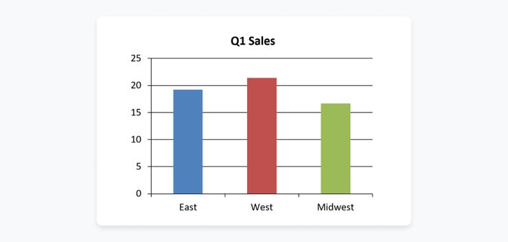
chart_data = CategoryChartData()
chart_data.categories = ['East', 'West', 'Midwest']
chart_data.add_series('Q1 Sales', (19.2, 21.4, 16.7))
# Add slide
slide_layout = prs.slide_layouts[5]
slide = prs.slides.add_slide(slide_layout)
# Add chart to the slide
x, y, cx, cy = Inches(2), Inches(2), Inches(6), Inches(4.5)
chart = slide.shapes.add_chart(
XL_CHART_TYPE.COLUMN_CLUSTERED, x, y, cx, cy, chart_data
).chart
# Save presentation
prs.save("chart.pptx")
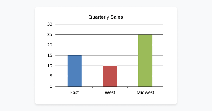
Example 2: Dynamically update chart data
from pptx import Presentation
from pptx.chart.data import CategoryChartData

# Open presentation
prs = Presentation("chart.pptx")
chart = prs.slides[0].shapes[1].chart

# Chart data
chart_data = CategoryChartData()
chart_data.categories = ['East', 'West', 'Midwest']
chart_data.add_series('Q2 Sales', (15, 10, 25))

# Replace chart data
chart.replace_data(chart_data)

# Save presentation
prs.save("updated_chart.pptx")
Expanded example: Embedding a Matplotlib/Plotly chart as PNG with dynamic sizing & cropping
import matplotlib.pyplot as plt
from pptx import Presentation
from pptx.util import Inches
# Assume df is the Pandas DataFrame from your pipeline

# Generate high-resolution chart
fig, ax = plt.subplots(figsize=(8, 4.5))
df.plot(kind='bar', x='metric', y='value', ax=ax, color='#00A4EF')
ax.set_title('Monthly KPI Trend')
plt.tight_layout()
plt.savefig('dynamic_chart.png', dpi=300, bbox_inches='tight')
plt.close()

# Load template and insert at precise position on target slide
prs = Presentation('monthly_kpi_template.pptx')
slide = prs.slides[3]  # target slide index

left = Inches(1.0)
top = Inches(2.0)
width = Inches(8.0)   # scale to fit template placeholder
height = Inches(4.0)

pic = slide.shapes.add_picture('dynamic_chart.png', left, top, width=width, height=height)

# Optional cropping for perfect alignment
# pic.crop_top = 0.05
# pic.crop_bottom = 0.05

prs.save('report_with_embedded_chart.pptx')
Dynamic sizing can be calculated from the DataFrame shape or slide layout dimensions; Pillow can be used pre-insertion for any final cropping.
Integrating with data sources
The real power emerges when python-pptx sits at the end of a full data pipeline. Here’s how we typically connect PostgreSQL → Pandas → presentation in a single script (works equally well inside Dagster ops or Django views).
from sqlalchemy import create_engine
import pandas as pd
from pptx import Presentation
from pptx.util import Inches

# Connect and query live data
engine = create_engine('postgresql+psycopg2://user:pass@localhost/dbname')
query = """
    SELECT category, value, month
    FROM kpis
    WHERE month = '2026-04'
"""
df = pd.read_sql(query, engine)

# Simple transformation
summary = df.groupby('category')['value'].sum().reset_index()

# Load branded template
prs = Presentation('kpi_template.pptx')

# Populate text placeholders and tables from DataFrame
for slide in prs.slides:
    for shape in slide.shapes:
        if shape.has_text_frame:
            # replace placeholders with computed values
            tf = shape.text_frame
            for p in tf.paragraphs:
                for run in p.runs:
                    if '{{TOTAL_KPI}}' in run.text:
                        run.text = run.text.replace('{{TOTAL_KPI}}', f"${summary['value'].sum():,.0f}")

# (Optional) Add a native table from DataFrame on a dedicated slide
slide = prs.slides[4]
left = Inches(1)
top = Inches(2)
width = Inches(8)
height = Inches(3)
table = slide.shapes.add_table(rows=len(summary)+1, cols=2, left=left, top=top, width=width, height=height).table
# populate header and rows...

prs.save('automated_kpi_report.pptx')
This pattern closes the loop: data flows from source → transformation → presentation with zero manual intervention.
Extract information
One of python-pptx's powerful features is information extraction. It allows you to read a pptx file and pull text, tables, or metadata, useful for validation steps inside pipelines or migrating legacy decks.
Example 1: Extract text from a PowerPoint presentation
from pptx import Presentation

def extract_text(ppt_file):
    ppt = Presentation(ppt_file)
    for slide in ppt.slides:
        for shape in slide.shapes:
            if shape.has_text_frame:
                for paragraph in shape.text_frame.paragraphs:
                    for run in paragraph.runs:
                        print(run.text)
ppt_file = "example.pptx"
extract_text(ppt_file)
PRO TIP: PowerPoint often splits paragraphs into multiple “runs” for formatting reasons. Therefore, to get all text from a paragraph, one must iterate over all runs in each paragraph. In pipelines we wrap this logic in reusable utility functions for easy testing and logging.
HttpResponse with application/vnd.openxmlformats-officedocument.presentationml.presentation).
- Add caching (Redis or filesystem) for expensive reports that run on large datasets or complex queries.
- Log generation duration, errors, and file size with structured logging (Dagster events or ELK stack) for observability.
- Test end-to-end with realistic data volumes and edge cases (missing values, very large images, long text).
PowerPoint automation with SoftKraft
If you’re looking for a development team to bring your document processing vision to life, we’d love to help. We offer Python developers outsourcing that simplify the implementation process, enabling you to achieve business results without the hassle. Our team will guide you in the planning and development of an end-to-end PowerPoint automation solution that perfectly aligns with your business requirements.

Conclusion
By treating PowerPoint decks as programmable artifacts rather than manual creations, analytics teams can close the loop on their data pipelines and deliver timely, consistent, branded reports at scale. The techniques above, from template-driven generation and dynamic chart embedding to full database integration and production hardening, have helped us ship hundreds of automated presentations without a single copy-paste error. Whether you’re building one-off scripts or enterprise-grade reporting platforms, python-pptx paired with modern data tools is the fastest path from database to executive deck. Ready to automate your next PowerPoint workflow? Check out our guides on Excel automation and Word automation to complete your Office automation toolkit.