Users will form an impression of your brand in a mere 0.05 second. Less than 1 second.
No matter how compelling your value proposition is or how long your list of features, if you don't have a well designed interface and thoughtful user experience, your SaaS product will fall flat.
Great SaaS design requires prioritizing user experience above all else, implementing industry-standard design rules, and embracing a mentality of iterative design. To help you impress users and retain them for the long term, we're going to break down the key components of great SaaS design.
Why great SaaS product design matters
A well-designed user interface (UI) is key to building a successful SaaS product. First impressions count, and if users don't like what they see, they won't give your application a chance.
Design also affects how users perceive your SaaS product's overall quality. If it looks well-designed, users will assume it's been thoroughly tested and is reliable. On the other hand, if your SaaS website looks dated or poorly designed, users will be less likely to trust it.
In short, great SaaS UX design can make or break the success of your product. When done right, the design process will be prioritized early in your product's development process. A winning design will provide a great customer experience that encourages regular engagement and helps your product to stand out from the competition in your industry.
Additionally, a well-designed application will actually enhance the features you've built in rather than detracting from them. Finally, great design will allow you to scale efficiently as your product grows over time.

It might be hard to justify investing in good design upfront, but in the long run, great SaaS product design can help you to:
Lower customer acquisition costs
Users simply expect software tools to be intuitive and easy to use. On average, you have only 15 seconds to convert or keep a user on your website. That's not a lot of time to prevent users from bouncing. You need a strong design that leads users to remain engaged and interested in your SaaS application.
If you can convert users early in their customer journey with your brand, you'll reduce spend on costly retargeting ads or direct sales campaigns. By prioritizing good design in not only your application itself but also the lead magnets and landing pages, you can keep customer acquisition costs low. \
Differentiate from direct competitors
The software as a service landscape is more competitive than ever. A well-designed SaaS product can help you build a strong brand identity that is necessary if you want to stand out from the competition.
In fact, your brand identity is one of the most important aspects of your SaaS app. It is what sets your application apart from the competition and also gives users a sense of trust and confidence in your product. A strong brand identity will help to attract new users and keep existing ones loyal.
So, while some companies are trying to spin up apps quickly that lack usability and a modern visual design, you should prioritize winning over potential customers with great design.
Increase customer lifetime value
Design and functionality go hand-in-hand. An experienced UI/UX designer will be familiar with the way human psychology plays into how users interact with digital technology. Design should not be in conflict with its function. Instead, it should work in tandem with the intended function, directing users to relevant actions within the Saas UI, while not overwhelming them.
As you build a list of features for your SaaS product, consider how the web design will contribute to its functionality rather than work against it. Prioritizing design in this way will help to prioritize customer success and keep paying customers happy. As you keep your customers happy, you improve customer loyalty. And with an increase in monthly recurring revenue from your paying customers, you will also see an increase in customer lifetime value metrics.
Scale your business faster
When building a SaaS platform, it's important to consider scalability. As your product's feature list and customers grow, you'll want the site's backend architecture to scale with it.
Brain Chesky, Airbnb CEO, has said “There's really two stages of a startup's product. The first is to design a perfect experience and then you scale that experience."
It's important not to neglect what Bran Chesky refers to as the second stage of any startup's product. Your design should be built in such a way that it lends itself to scalability. A good design plays an ongoing role in refining the user experience and ensuring new functionality and capabilities get added in a seamless, discoverable, and non-disruptive manner.
Common SaaS design problems
One of the best ways to begin thinking about how you can prioritize good design is by taking a look at some common design problems that SaaS products face. You should revisit this list throughout the UX design process to ensure you're able to deliver a product that users will love.
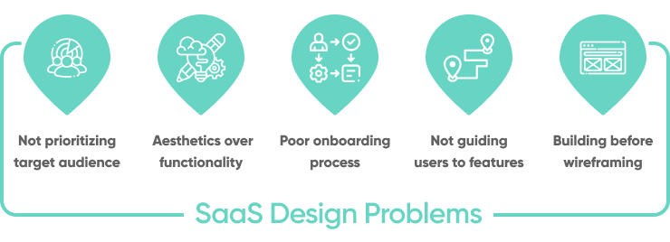
Not prioritizing your target audience
Businesses looking for a software service provider often start with a checklist of features they require. Many service providers will be excluded from consideration solely based on a lack - or perceived - lack of important features. A good design will showcase the most desirable features effectively for users as they evaluate SaaS providers.
To successfully prioritize the goals of potential users, you need to have done a sufficient amount of research into your target audience and their needs. The SaaS UX design should thoughtfully incorporate customer stories, so that users can quickly see how their needs will be met with your software.
As you prioritize the needs of your potential customer, you'll find it easier to convert and keep more customers.
Focusing on aesthetics over functionality
Aesthetics should never overpower the functionality of SaaS websites. Building a user-friendly product means finding a balance between functionality and aesthetics. While it's true that a modern or edgy design might help you stand out initially, you'll find that it will only get you so far.
Great SaaS product design requires a thoughtful balance between delivering an aesthetically pleasing design and a design that truly prioritizes delivering an easy-to-use and functional product.
Poor onboarding process
The registration process and software onboarding process are two key opportunities for SaaS companies to provide a positive experience for every new user. Often the onboarding process is an afterthought for companies rather than one of the intentionally curated design elements.
Utilizing one of many intelligent onboarding methods that makes onboarding easy, quick, and intuitive for new users is a great way to build early trust with customers. A great example of this is providing a step-by-step basic walkthrough for new users that is customized to the use case of the user.
The onboarding process is also a great time to offer quality client support, whether it be through guided tutorials, chat bots, or live touch points with your team. Offering these services can help to make sure new customers remain happy, which will help to keep churn rates low.
Not guiding users to relevant features
SaaS platforms should always be evolving and responding to user feedback. Because of this, your in-house team will likely be adding new features regularly. This is great, but the job isn't over after a new feature launches. You may think users will simply find these features themselves, but the problem is that users typically have very specific usage patterns and will likely not even realize anything has changed about the product design.
It's the job of your product design team to guide users to new features within the SaaS platform. A good way to do this is by using your SaaS dashboard design to highlight what's new. Ideally, the highlights should be customized to how a user currently uses the app, providing tips for how to integrate the new feature into their workflow.
If that doesn't work for your platform, there are other delivery models you can implement such as sending a new feature announcement via email or having account managers highlight the enhancements in client meetings.
Building before you wireframe
Wireframing should be a standard part of any software development project. As you design a SaaS application, you should employ wireframes as a way to visualize your UI design choices and customer journey.
In some ways, a wireframe is like a basic prototype which allows you to reduce the risk of building something that doesn't meet the project's requirements. It's much easier to make changes in a wireframe than it is in a final product.
When creating wireframes for SaaS applications, there are a few key things to keep in mind:
- Wireframes should be simple and easy to understand by all stakeholders, technical and non-technical.
- Wireframes should clearly show the structure and layout of the application, as well as the relationships between different pages and features.
- Wireframes should be flexible and easy to change as new information from users or other stakeholders is found.
- Wireframes should include coverage for both desktop and mobile devices.
- Wireframes should aim to provide an accessible interface for all users.
4 tips for designing a SaaS product users will love
Deliver simplicity (Occam's Razor)
Technical and functional requirements can lead to an overly complex SaaS website. A complex design can be difficult to maintain and more importantly, difficult to use.
Occam's Razor is a scientific and philosophical rule that states that the simplest answer is usually the correct one. Embracing this principle in your SaaS design can help to prioritize simplicity. To help embrace this principle:
- Hide the technical complexity of feature implementation behind your SaaS UI.
- Make sure all of your functions – especially the key ones — are self-explanatory.
- Maintain visual and functional simplicity wherever possible.
- When in doubt, go with the simplest option.
Put it into practice: Use visual simplicity in UI design
Users can't process large amounts of textual data. Too much information on a webpage, dashboard, or report can cause information overload and prevent a user from processing the information. To avoid this:
- Reduce the amount of data on any one page.
- Focus on one clear message on any given page.
- Summarize and group related information so that users can quickly find what they need.
- Try using cards or icons to reduce the clutter.
- Use data visualization tools to showcase relevant information.
When a part of your application does need to showcase a large amount of data, such as on a reports page, provide a sort/filter function to help users find what they need easily.
One example of this done really well is the Coda UI. Coda is a virtual document tool that brings words, data, and teams together. Coda's interface displays complicated information in a graphical format that makes it intuitive to interact with and easy to scan visually for a quick summary.
Use intuitive navigation (Jakob's Law)
Features can attract users, but usability keeps them. No matter how feature-rich or unique your SaaS website is, your users shouldn't get lost in its functionality.
Users spend a majority of their time on sites other than yours. They expect your site to function similarly to other sites. Users simply prefer familiarity. To ensure your SaaS app is intuitive to use, you should mirror common models that users are familiar with. Doing so will allow users to focus on using the application rather than learning how to use it.
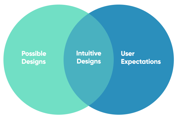
This design principle is called Jakob's Law. While there may be a large number of _possible _designs, designers should focus on delivering design systems that fits within general user expectation for how a website or application should function.
Avoid creating a unique design for uniqueness sake. Instead, focus on creating a familiar navigation and general UI architecture that will allow users to interact with your SaaS app intuitively.
Put it into practice: Use familiar dashboard layouts
Dashboards are the hub for user activity on SaaS applications. Well-designed dashboards help users find what they need, navigate the application, and see a summary of their most relevant data.
More than any other area of your site, the web design of the dashboard should follow industry standard practices. There are a few key things to keep in mind when optimizing dashboards on your application:
- Keep it simple: Dashboards should be easy to understand and use. Avoid overwhelming users with too much information.
- Use visuals: Use charts, graphs, and other visuals to help users understand data quickly and easily.
- Customize: Allow users to customize their dashboards so they can see the information that is most important to them.
- Keep it up to date: Make sure the data on your dashboards is always accurate and up to date.
- Get feedback: Ask users for feedback on your dashboards and make changes based on their feedback.
Limit the options (Hick's Law)
Hick's Law states that the more choices available, the longer it will take to make a decision. This principle can be applied to SaaS application design, specifically when designing menus or other navigational elements. If there are too many choices, it will take users longer to find what they're looking for and the overall usability of the application will suffer.
When considering UI design, think about the number of options available on any given screen. To help limit the number of choices a user has at any one time, break up processes into multiple screens. This can help to point users to the most important action at any given time.
Put it into practice: Offer quick registration
You can keep users engaged during the registration process by considering Hick's Law. As you design the screens of the registration, consider limiting the options available to users. Instead of having a drop down that has 10, 20 or even 30 options, ask users to select from a few limited options.
You can also keep users focused on one task at a time by asking each registration question individually - one screen at a time.
Drip's registration process does this really well. Instead of requiring a user to fill out a lengthy form all at once, each screen asks for one singular thing at a time. Drip's sign-up process keeps users engaged while reducing bounce rates that are common from long forms.
Prioritize customer success
No matter how thoughtful your user experience is, users will always have questions. And no matter how well engineered your app is, technical issues will always come up. Integrating support into your SaaS app in a meaningful way can help to prevent unnecessary user frustration. The goal should always have a clear focus on delivering success to your customers, so ask yourself how you can provide support to your users in-app to help them achieve success.
Consider offering multiple options for how users can get support. For immediate needs, you could offer a chatbot or phone support. For less responsive options, you could offer a web form or email address. Many users also find forums helpful, so they can get support from other users.
Regardless of the exact implementation, support should be an intentional part of your application design rather than an afterthought.
Put it into practice: Offert a step-by-step quick-start guide
Users want to start using your app quickly. They want to start realizing value from their investment. To help prioritize customer success, SaaS providers can offer a click-through quick-start guide to help users become familiar with the main screens and navigation within the application. This is a simple but effective method of providing early support for common user questions.
One company that does this really well is Hootsuite. Their UI provides simple, unobtrusive pop-ups to guide users through new features.
Conclusion
Users simply expect great design and as a SaaS business owner, it is your job to deliver just that. Investing in thoughtful, user-centric design is critical to succeeding in what is a very competitive market.
As you build out the UI for your SaaS product, remember to utilize the top tips we shared in this article. When in doubt, focus on delivering a great user experience above all else. Taking the time to design a thoughtful, user-centric SaaS product will help turn visitors into loyal customers.

![How to Design a SaaS Product Users Will Love [with examples]](/.netlify/images?url=_astro%2Fsaas-design.DvVqjher.png)


